| data entry • chart comparison • styles • methods • text manipulation • asteroids | ||
Based upon the First Tutorial here is the second, The Comparison of Charts |
||
What Ways does Kairon 3 offer to Compare two Charts?
Transparent Overlay ChartsEver seen an astrologer hold and rotate two printouts against a sun lit window and wondered how this cool kind of comparison could be done using a computer? - The answer would have been: "Wait until July 2004, buy an Apple Macintosh and grab yourself a copy of Kairon 3 ;-)
The Transparency setting is also very convenient to quickly create some Artistry based on your chart by means of overlaying it to an image (or simply your desktop) and performing a screenshot (apple-shift-3 viz. apple-shift-4). Get Ready for Synastry, Composite, Combine
What you select from the "Methods" charts popup menu will be compared to your selection from the application's menu bar's "Charts" menu, as soon as you click the "Show" button. The "Show" button will be renamed to "Hide" to indicate, that now it will turn off the selected method rather than turn it on. Special about SynastriesThe inner chart is always the one selected from the "Charts" menu of the menu bar. To define which objects will be shown inside and which objects will be shown outside go to the objects section of the Preferences dialog. In Versions less than 3.03 you need to click "OK" for your changes to take effect in the Preferences object's dialog. So, if you change the settings for "synastry" click "ok" before you go to "inner", or your new settings on "synastry" will be lost. This is not so with later versions. Special about CompositesComposites will unlock the location's
latitude fields and the search field. They can be localized. The ascendent
object is the composite ascendant which is the midpoint between both
chart's ascendants, while the first housecusp is the ascendant according
to the chosen house system and the chosen latitude. Both normally differ
from each other. Find out more on this in Robert Hand's famous classic: Planets in Composite: Analyzing Human Relationships (The Planet Series) Special about CombinesCombines are time - space - midpoint charts. They point at the exact center between both locations, no matter if this is under water or not, and mark out the chart that would have taken place in the exact second between both births. What is interesting about them is, that when a planet is on retograde, is slowing down or whatever, the midway in time is not the midway in degree. So, while on one hand the method is more artificial than the composite method, on the other hand it isn't. Composites and Combines have quite a number of lovers and opponents that often accept only either method and swear on that while hating the other. Yet, there are also a number of people who stick to both methods and many of these tend to say that a composite is more on the surface, more about what gets into a kind of first impression, while the combine hints at the more subtle, deeper rooted relation. Probably there is not a really straight way out of this. It seems more like a Koan, and truth, while being neither nor, can yet pointed out by both .. . ;-) ((meaning: people think differently, so they also understand differently... and so they also need different hints suiting their individual approach more. What properly guides one definitely misleads an other ... ))
|
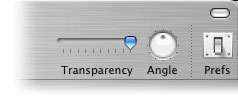 The
key to success in creating transparent overlay charts is to successfully
have turned on the buttons of the toolbar and to possess the two chartfiles
to be overlayed. To show and hide the toolbar is accomplished by clicking
ont the button on top right of your window
The
key to success in creating transparent overlay charts is to successfully
have turned on the buttons of the toolbar and to possess the two chartfiles
to be overlayed. To show and hide the toolbar is accomplished by clicking
ont the button on top right of your window 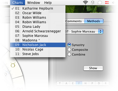
 |
|||
 |
|||